Pure css to make a button shine and gently change colors over time
Below is a video I made showing the finished product: you’ll notice when the button is at rest, the background color slowly shifts from dark blue to light blue and
5.4k
By Kate Angelou
Below is a video I made showing the finished product: you’ll notice when the button is at rest, the background color slowly shifts from dark blue to light blue and back again. And then when the mouse hovers over the button, it grows bigger, the background gradient shifts to a pink to blue gradient and a “shine effect” slides quickly across it from left to right.
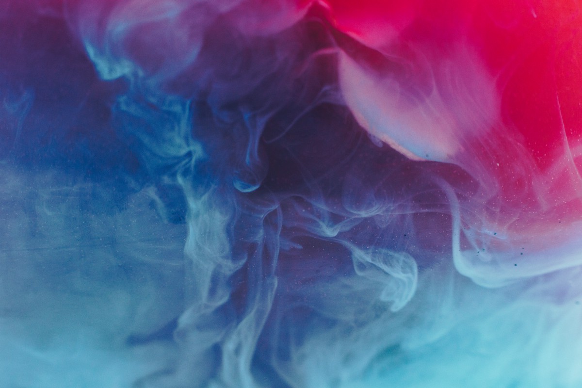
Video of the subscribe button in action: its slowly shifting gradient backgrounds, and how it grows and shines when a user hovers over it.
I’m pretty pleased with how this turned out, and it was really fun to work on to get it just right. The best part? Even though it may seem complicated at first glance, it’s really not that bad — all you need to know is CSS.
Shifting gradient backgrounds
Ok, the first thing I want to cover is how to give the button a color shifting background, both when it’s just at rest and also when a user mouses over it.
But before I cover that, let me show you the button’s base CSS.
Button base CSS
So my subscribe HTML <button /> element has a class of .subscribe-button attached to it, which is where I applied my basic styling. Please note: all of the CSS you’ll see is actually written in SCSS, a superset of CSS, but it should be simple enough to follow along with, and easy to convert to traditional CSS without much effort.
Subscribe.scss
Your basic button CSS — nothing too fancy here.
The CSS of this button is nothing out of the ordinary: font-size, font-weight, text color and text alignment inside the button, the size of the button itself, and a little stylish rounding of the button’s corners courtesy of the border-radius property. Easy enough.
Background gradient and animation CSS
Now to the fun part of the CSS: the background gradient. There’s two CSS elements at play here: the linear-gradient(), which is responsible for the background colors, and the keyframes, which handle the animation to make it appear to shift over time.
Here is the CSS I added to my button and the button’s :hover state as well to make this happen. Note the comment // button css here this is where the button’s original CSS is, I just omitted it from this screenshot for ease of seeing the additional code.
Subscribe.scss
The CSS to create the background gradients for the button and then animate the movement with the help of CSS keyframes animation.
linear-gradient() is a really cool function available in CSS, and it creates an image consisting of a progressive transition between two or more colors along a straight line. It can be rotated by degrees, with simple directions like: to left top, or with turn.some-percentage-here. You can also define at what percentage along the gradient’s length you want one color to begin or end.
There’s really so many different ways you can style these CSS gradients, I would highly encourage you to check out the MDN documentation, which does a great job explaining and showing interactive examples.
So the original background-image color is a gradient of two different medium blue hues: #8E9AC2 (my CSS variable $medBlueTint2) and #42579A ($medBlue), and angled at a 270 degree tilt. When the mouse hovers over the button, a new linear gradient is applied (because why not? ?), which is a bright blue (#2D8FE5) and a bright pink (#D155B8), that goes straight left now, and transitions gently from blue on the left to pink on the right.
The slow progression of the button’s background gradients from one color to another hinges on thebackground-size being much larger than the actual button itself (hence the reason I set it to 400% height and 400% width in the CSS with background-size: 400% 400%;). Then, the gradient (which is much larger than what you can actually see behind the button thanks to the button’s CSS property of overflow: hidden;) is animated using CSS keyframesand changing the background’s position to different points on the gradient as the animation progresses.
Inside of the keyframes CSS, the background-position is updated over the course of the animation. background-position sets the initial position for each background image: at the beginning (0%) and end (100%) of the animation, the piece of the background behind the button is the top left of side of the gradient (background-position: 1% 0%), at the middle of the animation (50%), the background will be positioned at the bottom right of the gradient (background-position: 99% 100%).
Finally, the keyframes defined are animated in the button with the CSS animation property: animation: TransitionBackground 10s ease infinite;. What this translates to is: animate the keyframe named TransitionBackground, at a rate of 10 seconds, ease it (so the animation has a slow start, then speeds up in the middle, before it slows down again at the end), and loop it infinitely.
And last, but certainly not least, I have to mention the transition: 0.6s property on the button’s CSS. As you may have noticed in the basic button’s CSS, the button’s dimensions were: height: 60px; and width: 200px;, but on hover, the button actually grows a bit to height: 75px; and width: 215px;. In order for the button to grow gradually on hover (or shrink when the mouse moves away), the transition property is needed. Otherwise, it will snap from smaller to larger and back again with no smooth growing or shrinking over the course of 0.6 seconds. Cool, huh?
Shine animation on hover
Next up is the little “shine” effect that zips quickly across the button when the user hovers over it. This little effect’s CSS looks deceptively complex, but it’s not too bad once I break down what’s happening.
Shine elements and animation CSS
The thing to understand for shine is that it employs the CSS pseudo-elements ::before and ::after.
If you’re not too familiar with pseudo-elements (I wasn’t until now), what they are is special keywords added to a selector that lets you style a specific part of the selected element(s). For example, to make the first line of every <p> tag specially styled with the ::first-line pseudo-element, you’d write the following CSS:
Note that in CSS3, pseudo-elements are defined in CSS with the ::pseudo-element, whereas traditional actions on elements like :hover, :focus, :disabled, etc. only have one colon at the beginning. There’s only 15 pseudo-elements at the time of my writing this, and some are still in the experimental stage, but I encourage you to check them out, they’re pretty cool.
Here’s the CSS for the shine effect on the button.
Subscribe.scss
The pseudo-element CSS for the button to make the shine effect and make it slide across the button on mouseover.
Although the shine effect looks like one element when you see it, it’s actually made up of two-elements: the Subscribe button’s ::before and ::after pseudo-elements.
The pseudo-element ::beforecreates an element that is the first child of the selected element. And likewise, the ::after pseudo-element makes an element that is the last child of the selected element. Both are often used to add cosmetic content to an element with the content property, which is how I employed them too. Note: You need to include content (even if it’s an empty string) as one of your CSS properties for these pseudo-elements or else the element won’t be visible in the browser.
If you look at the code screenshot, you’ll notice the pseudo-elements share a good bit of CSS: they both have empty content, they share the same display, position, height, top, and transform properties. Note also: both elements’ transform property actually starts them off the button 100px to the left, but because the button itself has the overflow: hidden; property, they aren’t visible to the naked eye (like the extra large gradient background too).
They also share the same background color of white, but the ::before's opacity is higher at 50% — the last element in rgba(255,255,255,0.5);, while the ::after element’s opacity is 20% (rgba(255,255,255,0.2);).
The ::before pseudo-element is slightly larger than the ::after (60px versus 30px), and its filter property is greater ,as well (blur(30px) versus blur(5px);).
Most of these decisions about opacity, size and blur were purely for aesthetics of how the shine looked to me. Feel free to tweak them to make the shine effect to your liking. I highly recommend changing various pieces to see what happens and if you like the look it gives you.
The part to really pay attention to is the CSS nested inside the &:hover state. This combination of transition and transform is what animates the shine and sends it flying from its original starting position, hidden off to the left, all the way across the button’s surface, until it’s hidden again on the right.
When you combine an element’s overflow: hidden; property , then add some pseudo-elements positioned to start beyond its original borders, and throw in a simple transform to shift them across it quickly, it ends up looking like a really cool shine running along the element. ?
So… why did I chose to use pseudo-elements instead of just making two new divs to be the shine effect, you ask? Mostly to make my life easier. Since the pseudo-elements automatically go with whatever element they’re part of, I didn’t have to worry about their height being off, their placement versus the button itself not matching, or having to deal with having them expanding at the same rate as the button size changes on hover, either. They’re the perfect solution for my particular use case.
Now let’s wrap this all up.
Putting it altogether
If you’re curious, here’s a screenshot of all my CSS in one place (plus comments), and if you’d like to see the actual code, it’s available on Github here.
Subscribes.scss
The complete CSS for the button in one place. From basic styling, to background gradients, to shine effects.
Yes, it looks a little intimidating at first glance, but once it’s dissected and discussed piece by piece, it’s really not all that bad, is it?